We’re upgrading StartupJobs’ visual identity
StartupJobs has grown. And hundreds of startups along with us. They’re conquering the world with their products. They’ve changed the daily lives of thousands of people in the Czech Republic. We’ve grown, too. Therefore, we’ve decided to change our visual identity. In order to symbolize what is the norm for us and startups: never ending upgrades.
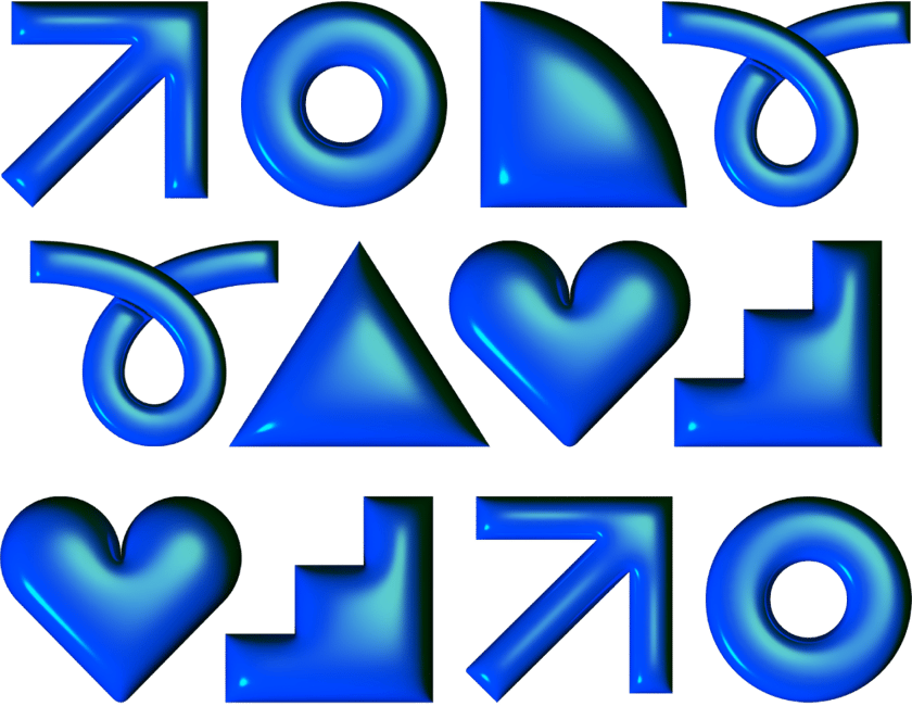
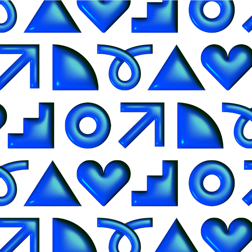
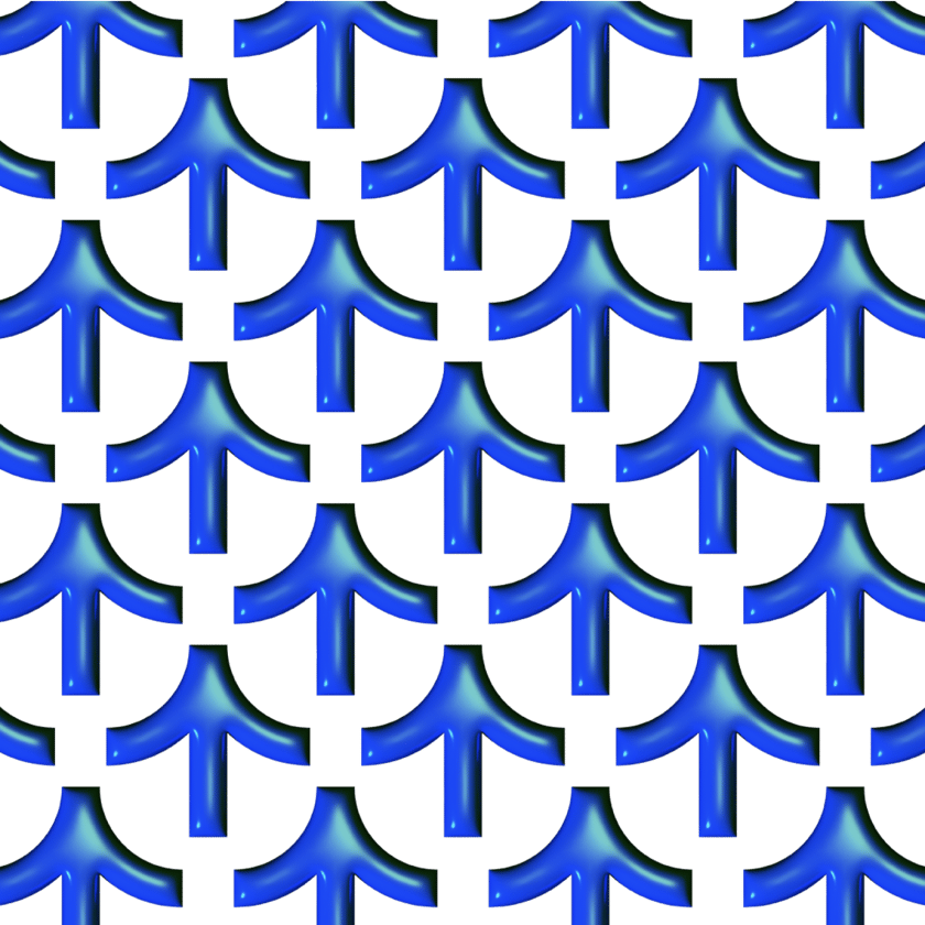
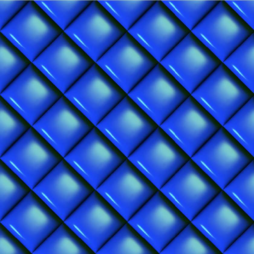
StartupJobs joined forces with Studio Najbrt and our new identity was born. One that will upgrade us and our companies.
Foundations of our new visual identity


About our new visual identity with Aleš Najbrt
Why did we decide to upgrade our visuals?

"The visual change is an ideal opportunity for us to adapt StartupJobs to expectations and needs of today's market, that is, like us, constantly evolving. We view the new StartupJobs identity as modern, technological and innovative - just like our clients and people who are looking for work with us. We’re honored to have been able to work with the best in the industry - Studio Najbrt - and we believe that thanks to it we’ll be able to upgrade the entire communication of the brand forward."
How was our new identity created?


- "Accepting some elements of our new identity took me a bit longer. Whether it's retro, futuristic, playful or provocative, it's an attractive design, noticeable and you can't get it out of your head for a long time. In the end, with this identity, I finally let my imagination run wild and realized that we want to do things differently and I fully stand behind it. This will also help us upgrade faster. I believe that users will gradually experience the same thing and embark on the same journey with us!"

Kuba
CMO
StartupJobs


Do you like how we’ve upgraded?
Level up with us!
We’ll help you with finding a job step by step and we’ll recommend content that’ll help you level up.